
Catherine Hope - Statistician, Department for Work and Pensions

Presenting data: 5 tips for making your data understandable

View over the shoulder of a person using the laptop with the screen showing the text '5 tips for making your data understandable for everyone'

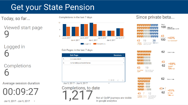
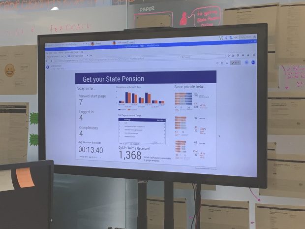
DWP statistician Catherine Hope leads the cross-government ‘Presentation Champions’ who share best practice for designing the best ways to present government data. In this blog she shares some tips on the best ways to make your information understandable.

Building a data dashboard for a service delivery team

Dashboard showing use of simple descriptions, columns of information, charts, a table for information that wouldn’t work well in a chart

I recently wrote about iterating the way we share data when the user needs of the teams we work with change. A quick recap. As digital performance analysts we’ve got lots of ways of sharing data: daily reports, weekly reports …

Data has users (with needs) too

Our new dashboard in Google Data Studio

I’m Catherine Hope and I lead the team of Digital Performance Analysts working in Newcastle on the DWP’s retirement provision services. I’m also the DWP’s Data Presentation Champion, and get very excited by charts! I’m going to tell you about …