A guest post by Ed Guccione, a performance analyst from DWP.
Google Analytics’s Average Time on Page can be a hugely important metric but also a very misleading one. As a mean average, it can be influenced by a skewed distribution, a problem that you can’t diagnose in the web interface. So I found a way to break down the data into individual visit lengths.
Google’s ‘average time on page’ isn’t all it seems
As a performance analyst, one of my tasks is to understand the amount of time users generally spend on a web page. This didn’t look like too much of an arduous task, even to a relative newbie like me. But as I’m a keen data geek and can’t just take the figure that’s presented to me, I started digging into the metrics ‘Time on Page’ and ‘Average Time on Page’.
After a bit of research, I had a hunch that the average time on page given in Google Analytics might not be a great way to get an understanding of user behaviour in every single case.
My logic goes: the websites we work with aren’t your average sites. We ask hard questions that might need a user to step away from the computer, go dig in a drawer and come back. Also, users aren’t standard: they don't all behave in the same way, and the tasks they’re performing aren’t done in anywhere near standard conditions - people have lives going on around this task. So there’s a significant chance that the mean average could be skewed by people who are simply distracted by Bake Off (other distracting TV shows are available).
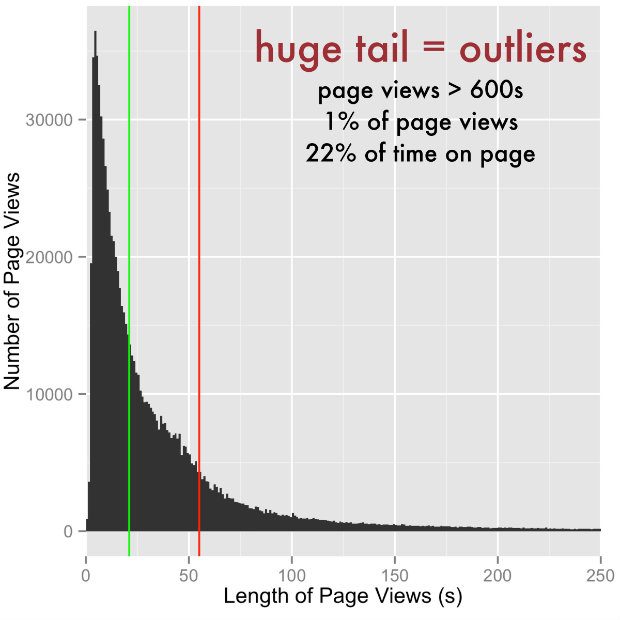
I was working on the Universal Jobmatch service and as you can see in the chart above, showing the number of pageviews of Universal Jobmatch advert pages separated by the duration of those pageviews, it looks like I was right. The distribution of users’ time on page is very skewed with a very long tail, where 1% of pageviews contribute 22% of the time spent on these pages.
This type of visualisation isn’t available in the Google Analytics web interface, so what did I do to get at this more nuanced data?
Finding the raw(ish) data
My journey to the chart above started by looking for ways to visualise the data in the Google Analytics interface, as I wanted to be able to break it down into individual visits. This is where my inexperience was really helpful, as it allowed me to experiment and be creative.
My reasoning was that if I could segment people by browser or operating system or location, or even the minute they visited the page, then I could segment people by combinations of those things (the Google Analytics API allows up to 7 dimensions at the same time). And in doing that I could cut the data so finely that I had the raw(ish) data for ‘time on page’.
The dimensions you choose to cut the data don’t have to be the same as mine. Some may be better than others, but the most powerful dimension is ‘Minute Index’, which separates pageviews by the minute the analytics hit was tracked.
Using R to process the data
I knew that doing this in the Google Analytics user interface wouldn’t be possible as it hasn’t got the functionality. Google Sheets with the API add-on is a good tool, but didn’t permit me to really play with the large amount of data that would be produced.
So I had a dig around and found the RGoogleAnalytics package. R is the perfect tool for this kind of analysis as it can handle a load of data and produce really good visualisations, and isn’t too hard to learn from scratch (as I did).
The Google Analytics package for R works in a very similar way to the Google Sheets add-on, but there is one very significant advantage: ‘paginate_query’, which allows the query to return more than 10,000 results - which is the Google Analytics API query maximum.
(It is actually possible to do this with the Google Sheets add-on or Google Apps scripts by altering the start index, but it would take a lot of manual work).
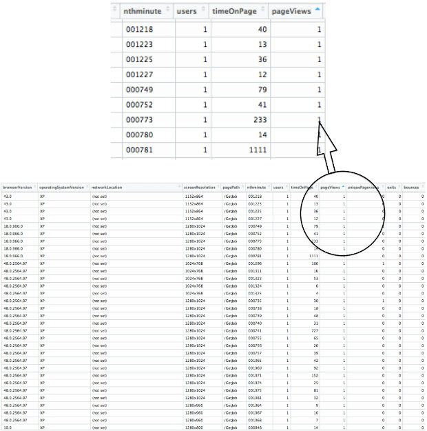
Using 7 dimensions produces something that looks like the table below and successfully splits the data down to one user and one pageview at a time, which is impressive when you consider that (a) the ‘page’ I’m looking at is a group of aggregated job adverts and (b) the Universal Jobmatch service has 1 million pageviews per day. That’s pretty big, and in fact the Universal Jobmatch start page was the most visited page on GOV.UK between October 2014 and October 2015.
I should add two caveats here. The first is that this method of analysing the data does not reveal any more personal information about users than is available through the Google Analytics user interface; it doesn’t allow you to identify an individual, only to separate hits.
Secondly, on a site as large as Universal Jobmatch, it’s not possible to get every last line down to one pageview using only 7 dimensions. So while it’s as close to the raw data as you’re going to get without using BigQuery, it’s not perfect.
The value of visualising the data
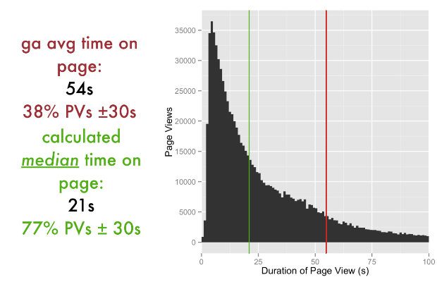
Using this raw(ish) data, you can ‘improve your average’. As you can see in the image below, for this day, for this service, Google Analytics’s Average Time on Page of 54 seconds (the red line) doesn’t really represent the distribution of time spent on this particular page.
It’s highly skewed by the pageviews that have really long durations, and as such is dragged away from the experience of typical users. In this case, the median 21 seconds (the green line), or ‘the middle value if you lined up all the durations one after the other in order’, would give you a better understanding of user behaviour than the mean.
However, what I think is really important about this work is not the summary statistics themselves but the ability to assess how appropriate they are, by visualising the distribution of your data. When you can see the distribution, you can see whether you’ve got a standard boring distribution, something highly skewed (like Universal Jobmatch) or something super exciting like a bimodal distribution.
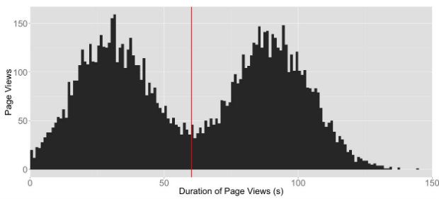
Imagine having an average time on page of 60 seconds. That’s not too crazy; nothing to worry about, right? But what if the data actually looked like this… that 60-second average doesn’t look so rosy now, does it? It’s disguising two totally separate user groups, one with an average time on page of 30 seconds and one with an average time on page of 90 seconds.
Think of all the fun you could have identifying what the characteristics of those two groups are and understanding why one group spends 3 times longer on the page. (Obviously this isn’t real data and you’d probably never get something as clear-cut as this.)
I think this technique could be very useful in some situations, even if it’s just to prove to yourself that using the average time on page is fine for your data.
Finally, after finishing this work I spotted Simo Ahava’s blog, which describes useful custom dimensions. He explains how to create a unique session ID, which would be a perfect way to split up sessions or pageviews to individual users and give you even better data to play with.
Over to you
The code I used to perform the analysis is shown below. If you have any queries, suggestions or experiences of this kind of problem, please add a comment below.
R code to get the data from Google Analytics
# If you don't already have the package installed
# install.packages("RGoogleAnalytics")

require(RGoogleAnalytics)

# Authorize the Google Analytics account
# This need not be executed in every session once the token object is
# created and saved
# Create your client ID and secret using instructions here
# https://developers.google.com/identity/protocols/OAuth2#basicsteps

client.id <- "***********"
client.secret <- "*******************"
token <- Auth(client.id,client.secret)

# Save the token object for future sessions
save(token,file="./token_file")
ValidateToken(token)

# Set the dates for the query
WeekStartDate <- "2016-02-01"   # Date as a string in YYYY-MM-DD format
WeekEndingDate <- "2016-02-05"  # Date as a string in YYYY-MM-DD format
ga.WV_TimeOnPagedata <- data.frame()

# Query to extract raw(ish) data
ga.WV_TimeOnPage.list <- Init(start.date = WeekStartDate,
                              end.date = WeekEndingDate,
                              metrics = "ga:users,
                                         ga:timeOnPage,
                                         ga:pageViews,
                                         ga:uniquePageviews,
                                         ga:exits,
                                         ga:bounces",
                              dimensions = "ga:city,
                                            ga:browserVersion,
                                            ga:operatingSystemVersion,
                                            ga:networkLocation,
                                            ga:screenResolution,
                                            ga:pagePath,
                                            ga:nthminute",
                              filters = "ga:pagePath==/GetJob",
                              max.results = 99999,
                              table.id = "ga:**********")  # View ID

ga.WV_TimeOnPagequery<- QueryBuilder(ga.WV_TimeOnPage.list)
ga.WV_TimeOnPagedata <- GetReportData(ga.WV_TimeOnPagequery, token,paginate_query = T )

# Query to extract standard average time on page
ga.WV_avTimeOnPage.list <- Init(start.date = WeekStartDate,
                                end.date = WeekEndingDate,
                                metrics = "ga:avgtimeOnPage",
                                dimensions = "ga:pagePath",
                                filters = "ga:pagePath==/GetJob",
                                max.results = 99999,
                                table.id = "ga:**********")  # View ID

ga.WV_avTimeOnPagequery<- QueryBuilder(ga.WV_avTimeOnPage.list)
ga.WV_avTimeOnPagedata <- GetReportData(ga.WV_avTimeOnPagequery, token,paginate_query = T )

View(ga.WV_avTimeOnPagedata)

# My hamfisted way of creating a unique ID for each hit
nl = strsplit(ga.WV_TimeOnPagedata$networkLocation,' ')
ga.WV_TimeOnPagedata$nl <- sapply(nl, function(x){
 toupper(paste(substring(x, 1, 1), collapse = ""))})

resolution <- (strsplit(ga.WV_TimeOnPagedata$screenResolution, 'x'))
matrixresolution <- matrix(unlist(resolution),2)
matrixresolution1 <- as.numeric(matrixresolution[1,])
matrixresolutiona2 <- as.numeric(matrixresolution[2,])

ga.WV_TimeOnPagedata$res <- ga.WV_TimeOnPagedata$screenResolution

View(ga.WV_TimeOnPagedata)

ga.WV_TimeOnPagedata <- within(ga.WV_TimeOnPagedata, id <- paste(substring(city,1,1), browserVersion, operatingSystemVersion, nl,res, sep=""))
ga.WV_TimeOnPagedataOrig <- ga.WV_TimeOnPagedata
ga.WV_TimeOnPagedata <- ga.WV_TimeOnPagedata[,c("id","nthminute","pagePath","timeOnPage","pageViews","uniquePageviews", "users","exits","bounces")]

View(ga.WV_TimeOnPagedata)
R code to create the histogram
# If you don't already have the packages installed
# install.packages("ggplot2")
# install.packages("cwhmisc")

# Packages that are required for processing and creating the histogram
require(ggplot2)
require(cwhmisc)

# Processing data to calculate the averages for time on page (among other things)
ga.WV_TimeOnPagedata$pageViewsmExit <- ga.WV_TimeOnPagedata$pageViews-ga.WV_TimeOnPagedata$exits
ga.WV_TimeOnPagedata$timeOnPagebyPV <- ga.WV_TimeOnPagedata$timeOnPage/ga.WV_TimeOnPagedata$pageViewsmExit
ga.WV_TimeOnPagedata <- ga.WV_TimeOnPagedata
ga.WV_TimeOnPagedata_AV_data <- ga.WV_TimeOnPagedata[which (ga.WV_TimeOnPagedata$timeOnPage > 0),]

# Calculate averages
MEAN_calculated <- weighted.mean(ga.WV_TimeOnPagedata_AV_data$timeOnPagebyPV,ga.WV_TimeOnPagedata_AV_data$pageViewsmExit)
MEAN_GA <- ga.WV_avTimeOnPagedata$avgtimeOnPage
MEDIAN <- w.median(ga.WV_TimeOnPagedata_AV_data$timeOnPagebyPV,ga.WV_TimeOnPagedata_AV_data$pageViewsmExit)

# Create histogram
qplot(ga.WV_TimeOnPagedata$timeOnPagebyPV, data=ga.WV_TimeOnPagedata, weight=ga.WV_TimeOnPagedata$pageViewsmExit, geom="histogram", binwidth = 5)+
  geom_vline(aes(xintercept = MEDIAN), colour="green",size = 0.5)+
  geom_vline(aes(xintercept = MEAN_GA), colour="red",size = 0.5)+
  ylab("Number of Page Views") +
  xlab("Length of Page Views (s)")
Ed Guccione is a performance analyst in the Department for Work and Pensions (DWP).

1 comment
Comment by Angela posted on
This is really useful. Thank you. (And I loved 'This is where my inexperience was really helpful, as it allowed me to experiment and be creative.')