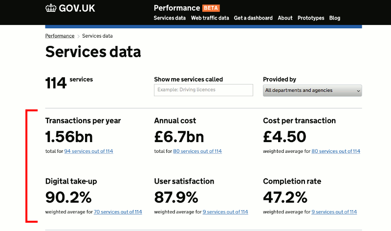
Our new Services page lists government services for which we have dashboards. We recently improved the page by adding key data for each service, including User satisfaction and Cost per transaction.
We want to make this information available to as many people as possible so accessibility testing is a part of the build process. In this post I’ll cover the ways we improved the accessibility of the page for people using screen readers or keyboard navigation.
How we tested it
Before I start, a quick note about some of the tools we used.
I checked the page for usability in JAWS 16 / Internet Explorer 11 on Windows, and Voiceover with Safari on Mac OS and iPad. I also checked colour contrast using Paciello Group’s Colour Contrast Analyser.
Of course, a developer wielding a screenreader only goes so far… we’re also lucky enough to work with accessibility consultant Léonie Watson. Where she made a recommendation, I’ve noted it below.
Sections and headings
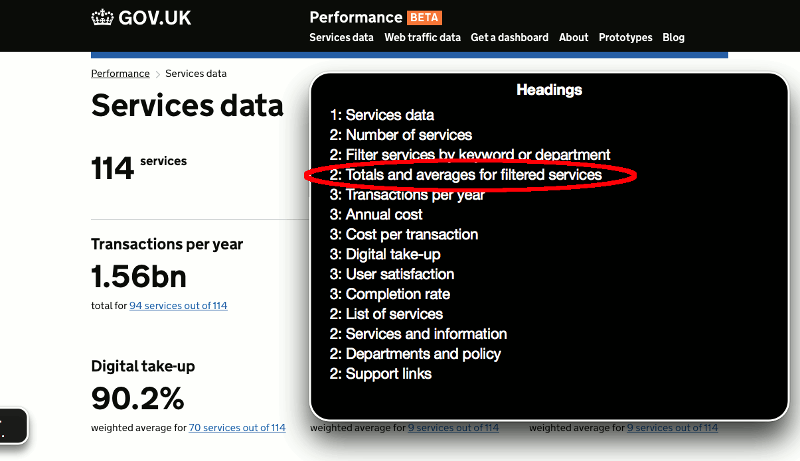
I wanted a screenreader user to be able to pull up a list of headings and get a clear picture of the breakdown of functionality of the page.
A sighted user gets cues from the visual design and layout, as to where each page section begins and ends. For example in the screen below, the group of 6 numbers beginning with ‘Transactions per year’ look like they form a section, as implied by the spacing and horizontal lines above and below the group.
A blind user obviously doesn’t benefit from this, but we can add a subheading that isn’t visible on the page itself but is picked up by a screenreader. It’s achievable by positioning the heading outside of the visible area of the screen.
“Totals and averages for filtered services” is a good descriptive heading for the group.. As in the screen below, the heading is now available in the Voiceover headings list to help the user navigate to that section.
Describing interactive elements
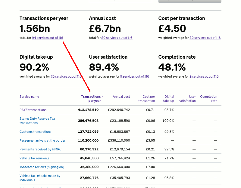
You can sort the list of services by selecting one of the column headings in the table. Again, a sighted user has a visual cue that this feature is available - the headings are styled as links. For screenreader users only, a label is appended to each column heading - “Click to sort”. I was appending that label to every column including the currently sorted one, until Léonie made this suggestion:
When a column is unsorted the hidden “Click to sort” information is helpful. Once the column has been sorted it isn’t needed though because screen readers will take the sorted state from the aria-sorted attribute.
The aria-sorted attribute is just applied to the column heading (the <th> tag) that the table is currently sorted by.
Supporting keyboard users
When the table of services is sorted by clicking a column heading, it seems simplest to re-render the whole table including the headings. It was only when I was testing with a screenreader that I saw this would cause a problem for any keyboard user. When the user clicks / selects a column heading link, keyboard focus is obviously on that element. If the element is then removed and refreshed, the focus is thrown back to the top of the page - not ideal as the user will want to remain in the same part of the page, eg. to reverse the sort order. So on sorting I replaced just the table rows and not the heading.
Sending keyboard focus to the activated area
There are two ways to affect the table sort order - the column headings which can be toggled as described above, but also the links higher up the page, below each summary figure. As Léonie pointed out:
Above the table there are some links that when clicked, change the table sort order. As they ‘activate’ the table in this way, the focus should be sent to the table so a screenreader can continue from there.
When a user clicks one of the links, the page is scrolled down to the table, and keyboard focus is now sent to it.
Notifying the user of changes to page content
When the user types into the filter box, or selects a department, the number of services in the list is filtered. This updates the services count and also the six summary figures.
Reading them all out each time seemed excessive. Léonie agreed -
In terms of the live region announcement, keeping it short is a good idea.
So we just let the screenreader announce that “Totals and averages have updated for 53 services”, then the user can choose to jump to that section if they want to read out all the updates.
We’d welcome any more feedback, please use the comment facility below!