We've been looking into how to reduce the amount of noise on our graphs.
Daily data often shows a lot of random fluctuation, especially since sample sizes are very low for small transactions. We're going to switch to weekly averages for several metrics to make the trend clearer.
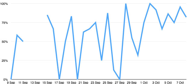
Here's a graph of user satisfaction for Prison visit bookings, showing daily data. It's pretty hard to discern the trend.
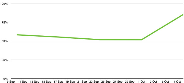
And here's the same graph with a weekly average. Much clearer.
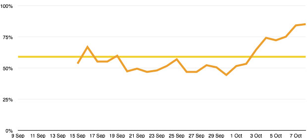
We also took a look at a couple of other ideas. The yellow line is an average for the whole graph. This misses the rising trend toward the end of the range. The orange line shows a weekly rolling average. This picks up the trend but is still a bit noisy.
So we're going to switch to weekly data for:
- digital take-up (typically postrooms and phone lines aren't open at the weekend, so weekends get 100%!)
- user satisfaction
- completion rate
We're not going to switch to weekly data for the volumetrics graphs, because it can be useful to compare demand on different days of the week.

3 comments
Comment by Stephen Edwards posted on
This would be a great development! When looking through lots of national statistics publications you see different rolling averages used and it might be worth getting in touch with some of those teams to learn some of the techniques they use?
Martin is right, it should be user selectable, but that is only because you are looking at very different user needs: service managers may want to see the daily spikes, whilst their digital leader may want to see the long term trend.
Comment by Henry Hadlow posted on
Hi Martin, you're right, of course. We haven't yet got this functionality, so in the mean-time we're going to change the default. We can keep your dashboard the same though! Will be in touch...
Comment by Martin Richardson posted on
I agree it is useful for data to be aggregated into periodic chunks to monitor trends - such as weekly or monthly user satisfaction. But it is additionally useful to see daily satisfaction - to highlight and monitor the impact of any temporary incidents. In an ideal world the time scale would be a user-controllable feature of the Platform (day/week/month/year).