Despite the current overhyped status of the internet of things, real-time and near real-time data is an important topic in both the private and public sectors. Whether the data is transactional in nature or sensor related for such things as energy consumption or people flow through a transit hub, challenges exist in how we define normal and detect the abnormal.
GOV.UK traffic
In GDS we have a great data source to test ideas on dealing with such high-velocity data. Our Google analytics data can be viewed and analysed in what is essentially real-time meaning that we have a comprehensive and reasonably clean dataset to play with.
Summary statistics for GOV.UK web traffic has existed for some time on the performance platform however we have never really looked into how predictable browsing patterns are across both the entire site and our top content.
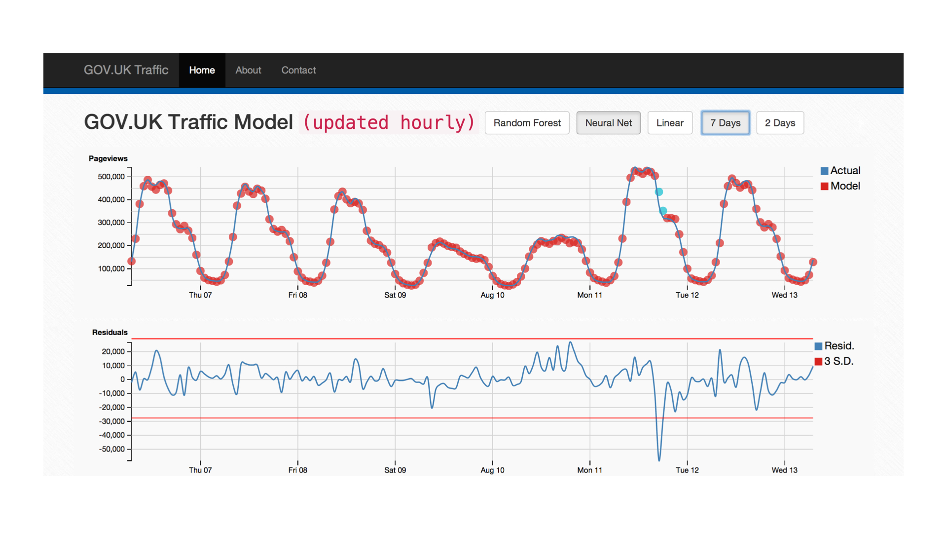
The above image is a first pass at building a tool for monitoring our website traffic. The top chart shows the hourly GOV.UK pageviews overlaid with predicted values in red. Three models are compared which use pageview numbers from the past 72 hours to try and predict the following hour's value:
- Linear: simple approach which makes the assumption that the future value can be predicted by some linear combination of the inputs.
- Random Forest: ensemble of decision trees which is essentially non-parametric due to the effectiveness of default parameter settings.
- Neural Network: feed forward multilayer perceptron with 2 layers of 40 neurons. The network is trained until a preselected error threshold is met.
In the prototype itself, you can view the outputs of all three models individually using the buttons at the top of the page. The second chart is a residual plot which highlights the accuracy of the predictions and provides the three standard deviation (3σ) markers. These lines define the cutoff at which an event is considered anomalous and this is reflected in the colour of the data points in the first plot changing from red to blue.
It's clear that the two more complex models perform better than the simple linear approach, this is perhaps no surprise as what we gain in interpretability we lose in model flexibility. In each case the models are trained on 3 weeks worth of data and are used to predict the following week (hour-by-hour). This helps circumvent overfitting issues and allows insight to be gained in terms of general model performance.
What about specific pages?
From looking at the first chart, it's clear that the overall site traffic is reasonably predictable day-to-day. There are clear patterns with dips around lunchtime, hometime and overnight. On a slightly longer timescale, the maximum pageviews seem to occur on a monday with each day thereafter exhibiting a similar daily pattern with a smaller peak value.
while not trivial to fit precisely, there rarely occurs anomalies on such a scale as to disrupt this pattern. In an attempt to extend this approach to specific pages, individual models were trained on the top 50 most popular content with varying levels of success. The patterns for these pages are much more noisy than the total website values and are potentially of more interest when studying anomaly detection.

The heatmap above is an attempt at displaying this breadth of data in an intuitive way using colour coding to flag degrees of severity where the actual value and model prediction disagree. For each page, the Random Forest algorithm is run three times and the average is taken. In addition, the linear model is also used and the weighted residual based on model R2 is used to determine whether an hour is considered anomalous. This approach is used because neither approach consistently yields the best estimate in all cases and as such, this higher threshold for flagging anomalies is used. The neural nets were not used here due to model training time limitations.
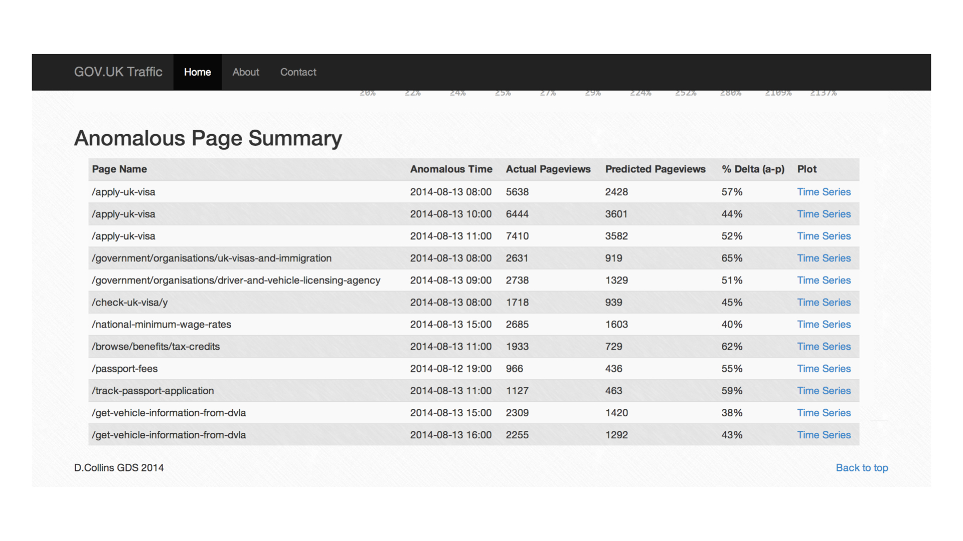
All anomalies can be interrogated further by clicking in the table view which plots the respective timeseries. This is useful as it gives context to the prediction and allows the user to see whether the hour in question should really be deemed anomalous.
This prototype is far from perfect however the approaches it trials are general enough to be used in several different fields. With more and more data being collected across Government departments, finding the needle in the haystack could well be a problem that is hard to avoid.