The Foreign Office have embraced social media in recent years. Their accounts include the popular travel advice account which gives much needed advice to British nationals and British Ambassadors overseas.
In addition to the communication aspect, Twitter accounts hold invaluable information about the actual follower networks that form around individual accounts. Toby Butler and Elizabeth Flinter in the FCO's Digital Transformation Unit were particularly interested in this untapped potential, especially when applied to Ambassadors and Consuls General. These roles have social interaction at their hearts and an interesting question lies in the contrast - if any - between their digital and physical networks.
Network diagrams and the Twitter API
There are many free tools online that allow you to get summary stats on follower activity, retweet counts and influence metrics however the ability to map one's network is not readily available. One reason for this lies in the restriction put in place by Twitter to limit the rate at which data can be extracted from their application programming interface (API).
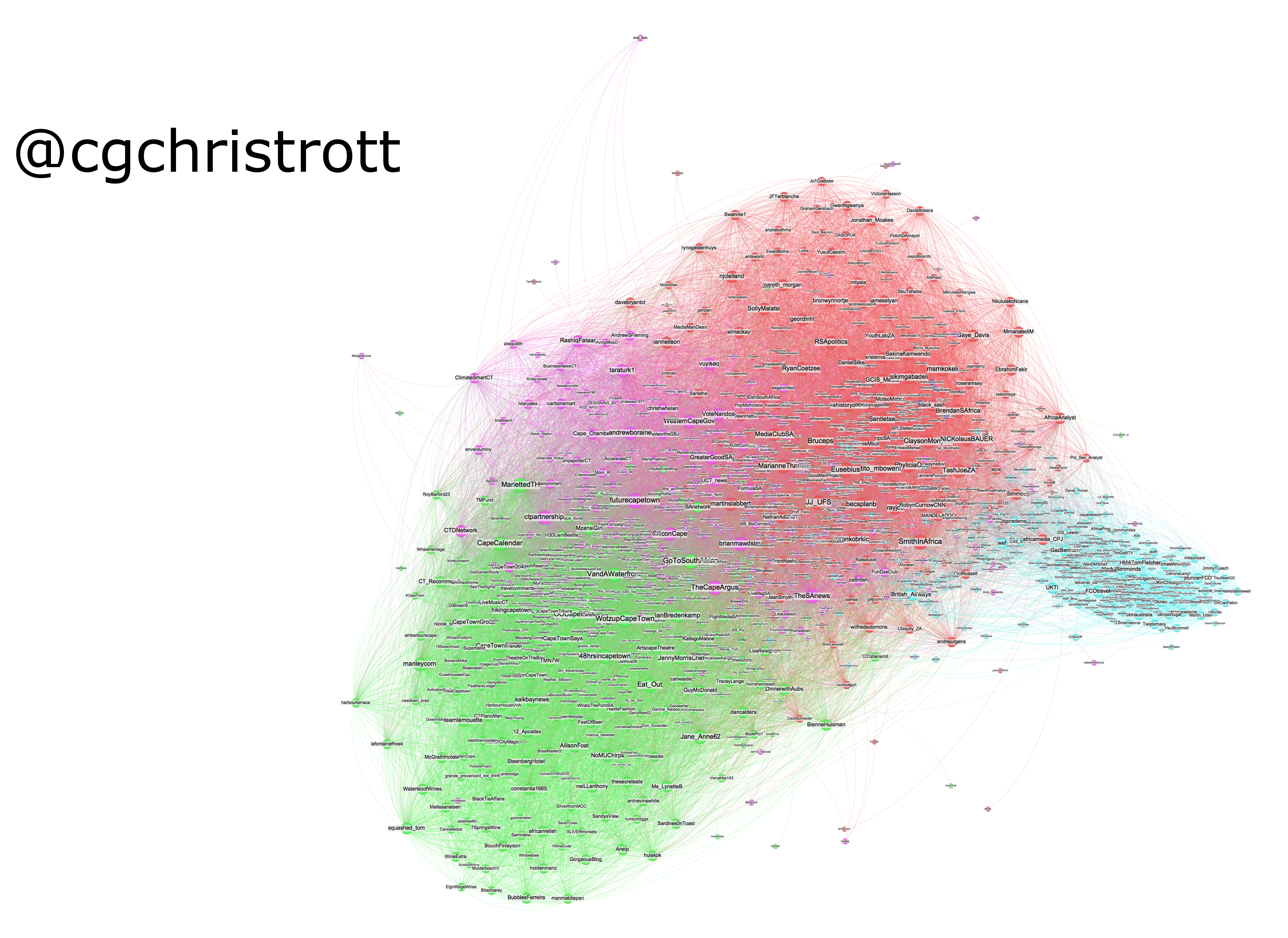
In order to extract the raw data for this network, it is necessary to find the complete follower list of each of the target account's followers. In the above case, this is Christ Trott's network who is UK Consul General in Cape Town. The rate restrictions mean that the time to generate such visualisations is approximately equal to the number of followers in minutes which is clearly untenable for popular accounts which can often run into the tens or hundreds of thousands.
Gephi and open-source
The visual representation of these social networks is handled by the excellent Gephi software which is an open-source interactive visualisation and exploration platform. The power of Gephi lies in the ability to display complex systems in a way which enables the viewer to discern patterns and make hypotheses which are otherwise difficult to frame using raw data alone.
In Chris Trott's example we see several features which are significant yet typical of these network diagrams:
- Node size reflects account importance: typically weighted by either incoming connections/followers or eigenvalue centrality which reflects how well connected an individual is to parts of the network with greatest connectivity.
- Cluster colours separate individual communities: community detection algorithm is applied to the network and identifies potential clusters based on the Louvain method which decomposes the network into densely connected nodes separated by sparse interconnections.
- Position of nodes dictated by a force-directed model: this algorithm treats the network as a physical mass-spring system with a combination of attractive and repulsive forces between edges and nodes. This technique enables an aesthetically pleasing arrangement with minimal overlap and no graph theoretic assumptions.
The implementation of these algorithms are handled inside Gephi's graphical interface with results that are visualised in realtime. In general, caution should be exercised with such 'point-and-click' implementations with the number of input parameters meaning that some knowledge of the theoretical background is useful in ensuring interpretability.
Without subject matter experts the subtleties of the detected communities can sometimes be lost. To address this issue, each of the created diagrams were presented to the FCO representative in question allowing insights to be gained regarding key accounts and the overall balance of the network when compared to the more tangible physical one.
As outlined in Toby Butler's upcoming post, Chris Trott's network consists of four distinct groups which can be split into a dominant South African contingent and a single FCO cluster with many accounts appearing in the official Twitter list.
Interestingly, the remaining communities can be classified in a reasonably well defined way which makes sense when viewed against the Consul General's mission in South Africa:
- Red: political cluster
- Pink: industrial and environmental community issues
- Green: South African Twitter/blogging groups
Actionable insights
These networks are static views and their construction is limited by the Twitter restrictions (sampling techniques have been trialled with some success). Beyond the comparison and identification of digital connections, a fascinating extension would be to trace retweets and tweets through these established networks. This approach would enable visual assessment of how well a message penetrates and whether specific targeting is effective.
This approach is certainly possible and could go hand-in-hand with a modified approach of generating connectivity patterns from assessment of tweet patterns. This would enable the use of the Twitter Firehose which has less stringent API restrictions. In addition it should be possible to programmatically extract commonalities between profiles in each cluster which would aid in automated identification of community themes.

